From Numbers to Narratives: How Data Visualization Makes Insights Accessible
In a world inundated with data, the ability to extract meaningful insights and communicate them effectively has become a crucial skill. While raw numbers hold the power to transform industries, they often remain impenetrable to those without a technical background. This is where data visualization emerges as a game-changer, turning complex datasets into compelling narratives that everyone can understand.
The Power of Visualization
Data visualization bridges the gap between data science and decision-making. It transforms rows and columns of raw data into visual formats like charts, graphs, and dashboards, making patterns, trends, and outliers instantly recognizable. A well-crafted visualization not only saves time but also ensures that insights resonate with a diverse audience—whether they’re seasoned analysts, executives, or stakeholders with minimal technical expertise.
Why Accessibility Matters
Imagine presenting a 20-page report filled with statistical tables to a team of non-technical professionals. Chances are, they’ll feel overwhelmed or disengaged. Now, consider presenting the same information through an interactive dashboard, where users can click through visualizations that tell a story—sales trends over time, customer demographics, or areas for operational improvement. The shift is profound. By making data accessible and digestible, visualization empowers teams to make informed decisions quickly.
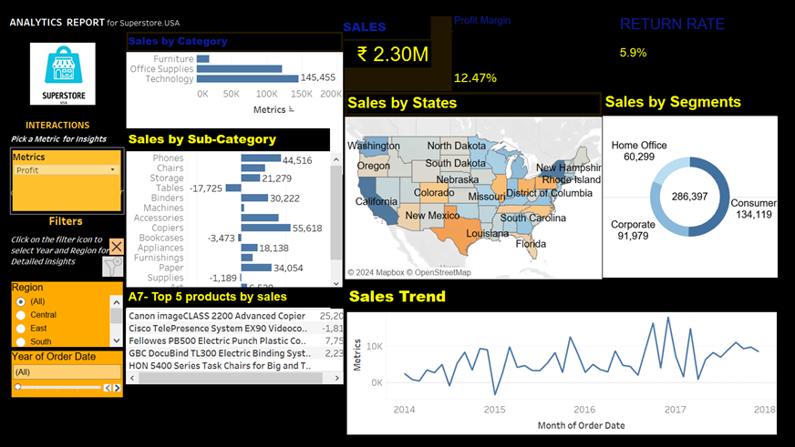
Tableau: A Leading Example
Tableau is a powerful tool that exemplifies the impact of data visualization. Designed with user-friendliness in mind, Tableau allows users to connect to various data sources, create interactive dashboards, and share their findings seamlessly. Its drag-and-drop interface ensures that even those with limited technical skills can design impactful visualizations.
For example, a retail company can use Tableau to:
Analyse Sales Trends: Visualizing sales data over time to identify peak seasons and optimize inventory.
Understand Customer Behavior: Segmenting customers based on purchase history and preferences.
Monitor Operational Efficiency: Tracking metrics like delivery times and inventory turnover to improve logistics.
These visualizations not only clarify complex datasets but also inspire action, turning abstract insights into real-world strategies.
Best Practices for Effective Data Visualization
Creating impactful visualizations requires more than just technical know-how. Here are some key principles to keep in mind:
Know Your Audience: Tailor visualizations to the needs and knowledge level of your audience. Avoid jargon and overly technical details when presenting to non-experts.
Keep it Simple: Resist the urge to overcomplicate. Use clear labels, concise titles, and straightforward visuals.
Tell a Story: Every visualization should have a purpose. Frame your visuals in a way that leads your audience through a narrative—from problem identification to actionable insights.
Focus on Clarity: Choose the right type of chart or graph for your data. For instance, use line charts for trends, bar charts for comparisons, and heatmaps for identifying patterns.
Leverage Interactivity: Tools like Tableau allow users to interact with data, filter results, and drill down into details. This enhances engagement and fosters a deeper understanding.
Bridging the Gap with Data Visualization
Data visualization is more than just a technical skill—it’s an essential communication tool. By translating numbers into narratives, organizations can foster collaboration, drive innovation, and make data-driven decisions with confidence. Tools like Tableau not only democratize data but also transform how we perceive and interact with it.
In today’s data-driven era, the ability to tell stories with data isn’t just desirable; it’s indispensable. Whether you’re a seasoned analyst or a curious beginner, embracing data visualization will unlock new possibilities—turning raw numbers into narratives that inspire action and deliver results.


Comments
Post a Comment